
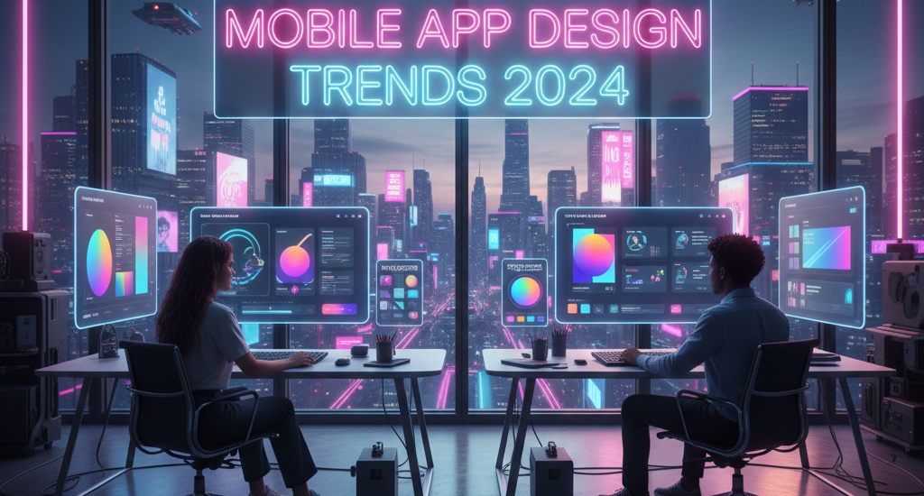
Mobile App Design Trends 2024: Shaping the Future of Digital Experiences
Introduction
Mobile App Design Trends 2024
The mobile app design landscape is in constant evolution, driven by technological advances, changing user expectations, and the creative vision of designers pushing boundaries. As we navigate through 2024, mobile app design has matured beyond mere aesthetics into a sophisticated discipline that balances beauty with functionality, innovation with usability, and creativity with accessibility. The apps that succeed in today’s competitive marketplace don’t just look good—they provide intuitive, delightful experiences that anticipate user needs and adapt to individual preferences.
This year has brought remarkable shifts in how designers approach mobile interfaces. Artificial intelligence has moved from buzzword to practical implementation, transforming personalization and interaction patterns. Immersive technologies are creating depth and dimension previously impossible on flat screens. Accessibility has evolved from afterthought to fundamental design principle, recognizing that inclusive design benefits everyone. Sustainability considerations are influencing everything from dark modes to data efficiency.
Understanding current design trends isn’t about blindly following fashion—it’s about recognizing patterns that improve user experiences and align with evolving technological capabilities. This comprehensive guide explores the defining mobile app design trends of 2024, examining not just what’s popular but why these trends matter and how they’re reshaping digital experiences for billions of users worldwide.
AI-Powered Personalization and Adaptive Interfaces
Artificial intelligence has fundamentally transformed mobile app design, moving beyond simple recommendations to creating truly adaptive interfaces that evolve based on individual user behavior, preferences, and contexts.
Modern apps leverage AI to analyze usage patterns, learning how individual users interact with features and content. Netflix reorganizes its entire interface based on what you’re likely to watch. Spotify curates the entire discovery experience around your musical tastes. This predictive interface adaptation anticipates needs before users articulate them.
Smart assistants integrated into apps provide conversational interfaces that feel natural. Contextual AI understands not just what you’re doing but why, offering assistance at precisely the right moments. A fitness app might suggest easier workouts when detecting stress based on usage patterns and calendar events.
Dynamic content generation using AI creates personalized imagery, layouts, and color schemes. Apps experiment with interfaces that rearrange themselves based on usage, hiding rarely-accessed features while promoting frequently-used functions.
The design challenge is balancing personalization with predictability. Transparent AI—where apps explain why they’re showing specific content—builds trust while maintaining personalization benefits.
Immersive 3D Elements and Spatial Design
The boundaries between 2D and 3D design are blurring as mobile devices gain processing power and designers explore depth, dimension, and spatial relationships.
Three-dimensional elements appear throughout interfaces as functional components that aid understanding. Product visualization apps use photorealistic 3D rendering allowing users to examine items from every angle and see products in context through augmented reality. E-commerce apps implementing 3D product views see significantly higher engagement and conversion rates.
Parallax scrolling and layered depth create the illusion of three-dimensional space. As users scroll, foreground elements move faster than backgrounds, creating depth perception that makes interfaces feel alive and responsive. These effects guide attention and create visual hierarchy when implemented thoughtfully.
Neumorphism and glassmorphism—design styles emphasizing realistic shadows, highlights, and translucent materials—continue evolving. These aesthetics create interfaces that feel tangible and tactile. While earlier implementations sometimes sacrificed usability, 2024’s refined approaches balance visual appeal with clear functionality.
Spatial audio creates three-dimensional soundscapes enhancing immersion in gaming, meditation, and navigation apps. Directional audio cues can guide users through interfaces or provide ambient context without visual clutter.
The key is purposeful implementation. 3D elements should enhance functionality rather than existing solely for visual impact.
Dark Mode and Advanced Color Strategies
Dark mode has evolved from trendy option to expected feature, but 2024’s approach goes far beyond simple inverted color schemes.
True dark mode implementations carefully consider color temperature, contrast ratios, and usage contexts. Rather than pure black backgrounds, sophisticated dark modes use deep grays and blues that reduce eye strain while maintaining visual hierarchy. Selective color use in dark interfaces draws attention effectively.
Automatic theme switching based on ambient light, time of day, or location creates seamless transitions. Apps detect sunset and gradually shift to darker palettes, preventing jarring changes. Some offer multiple dark mode variations—OLED-optimized pure blacks, medium dark for mixed lighting, and subtle dark for minimal eye strain.
Dynamic color systems that adapt to content or user preferences are gaining sophistication. Apps extract dominant colors from photos or brand materials, generating cohesive color schemes. Material You’s dynamic color system has inspired broader adoption of personalized theming.
Gradient overlays and color transitions create visual interest without complex graphics. Subtle animated gradients provide movement and energy while helping differentiate sections and guide attention.
Accessibility considerations drive color strategy evolution. Designers ensure adequate contrast ratios, provide color-independent information, and test with color blindness simulations. Advanced features include customizable filters and high-contrast modes.
Minimalist and Content-First Approaches
The minimalist movement in app design has matured from stark, almost sterile interfaces into refined, content-focused experiences that emphasize clarity and purpose.
Generous white space (or in dark mode, negative space) allows content to breathe, reducing cognitive load and directing attention to what matters. Rather than cramming every pixel with information or functionality, modern apps embrace emptiness as a design element that creates calm, focused experiences.
Typography has emerged as a primary design element, with bold, expressive fonts conveying personality and hierarchy. Large, readable text isn’t just an accessibility feature—it’s a design statement. Apps use typography creatively, with varied weights, sizes, and styles replacing graphics for visual interest. Custom fonts reinforce brand identity while maintaining readability across devices and screen sizes.
Icon design has simplified toward clearer, more recognizable symbols. Detailed skeuomorphic icons have given way to simple line icons that read quickly and scale beautifully. Consistency in icon style throughout apps creates cohesive visual languages that users understand intuitively.
Simplified navigation patterns reduce confusion and cognitive overhead. Bottom navigation bars consolidating primary functions, gesture-based interactions replacing visible controls, and contextual menus appearing only when relevant all contribute to cleaner interfaces. The trend is toward interfaces that get out of the way, letting content and functionality shine.
Card-based layouts continue dominating because they organize information clearly, adapt well to different screen sizes, and feel familiar to users across platforms. Cards provide natural containers for diverse content types while maintaining consistent visual structure.
Microinteractions and Delightful Details
Microinteractions—small, purposeful animations and responses to user actions—have become essential in creating apps that feel polished, responsive, and satisfying to use.
Loading animations transform frustrating waits into engaging moments. Rather than static spinners, creative loading states show progress through animated illustrations, provide useful information, or entertain with micro-games. Apps that acknowledge loading times while making them feel shorter through engaging animations maintain user patience and reduce perceived delays.
Button states and haptic feedback create tangible responses to touches. Buttons that appear to depress when tapped, checkboxes that bounce when checked, or switches that slide with satisfying resistance make interfaces feel real and responsive. Subtle haptic vibrations synchronized with visual feedback reinforce the sensation that digital actions have physical consequences.
Transition animations between screens guide user understanding of app structure and navigation. Rather than abrupt cuts between views, smooth transitions show spatial relationships—a detail view sliding up from a thumbnail, a menu expanding from its trigger button, or a form progressing through stages. These animations create continuity and help users maintain orientation.
Pull-to-refresh gestures with creative animations have become opportunities for brand expression. Rather than generic spinners, apps animate characters, logos, or contextual graphics that entertain during refresh. These small moments of delight build emotional connections with apps.
Empty states—screens that appear when no content exists yet—transform potentially negative experiences into positive ones. Instead of bare screens saying “no content,” thoughtfully designed empty states explain why nothing’s there, suggest actions, or add personality through illustration and copy. A meditation app’s empty state might show peaceful imagery encouraging users to start their first session.
The key is restraint—microinteractions should enhance rather than distract. Subtle, purposeful animations that communicate state changes or guide attention succeed; excessive, gratuitous animations frustrate users and drain batteries.
Voice and Conversational Interfaces
Voice interaction has matured beyond simple commands into natural, contextual conversations that feel increasingly human.
Voice-first interfaces recognize that typing on mobile keyboards is often inconvenient. Apps optimizing for voice input allow hands-free message composition, search, or navigation. Improved natural language processing understands context and handles ambiguity.
Multimodal interfaces combine voice, touch, and visual feedback for flexibility. Users might voice-search for products then refine results through filters, or start navigation with voice then adjust with touch. The best implementations allow seamless switching between input methods.
Voice feedback and audio interfaces serve accessibility while benefiting all users. Apps providing audio descriptions, spoken confirmations, or ambient sound cues create richer experiences.
Conversational UI patterns—chat-like interfaces where apps and users exchange messages—create familiar interactions. Banking apps allow natural queries like “How much did I spend on dining last month?” rather than navigating reports.
The challenge is accuracy and privacy. Voice recognition must work reliably across accents and environments. Users need confidence that voice data is protected and appropriately processed.
Augmented Reality Integration
Augmented reality has transitioned from experimental novelty to practical feature enhancing real-world utility and engagement.
AR try-before-you-buy experiences have revolutionized retail apps. Users visualize furniture in their homes, try on glasses or makeup virtually, or see how paint colors look on their walls before purchasing. These implementations increase buyer confidence while reducing returns, benefiting both users and businesses.
Navigation and wayfinding using AR overlay directional arrows and information on real-world views through phone cameras. Walking directions that show arrows on actual sidewalks feel more intuitive than map abstractions. Indoor navigation for airports, malls, or museums using AR makes complex spaces navigable.
Educational and informational AR adds context to physical world. Museum apps that overlay historical information on artifacts, plant identification apps that label species when pointing cameras at flowers, or astronomy apps identifying constellations when aimed at night skies make learning interactive and contextual.
Social AR filters and effects, popularized by Snapchat and Instagram, continue evolving beyond entertainment into expressive communication tools and brand experiences. Companies create branded AR experiences for marketing, while users generate and share custom filters, democratizing AR creation.
Implementation requires balancing capability with usability. AR features should enhance rather than replace traditional interfaces, providing genuine utility rather than gimmicks. Not all devices support AR equally, necessitating graceful degradation for older hardware.
Accessibility-First Design
Accessibility has evolved from compliance checkbox to fundamental design principle, with 2024 marking a shift toward universal design benefiting everyone.
Inclusive design processes involve users with diverse abilities throughout development. Apps testing with screen readers, voice control, and assistive technologies from inception rather than as afterthoughts create genuinely accessible experiences. Designers recognize that accessibility features—captions, voice control, high contrast—benefit all users in various contexts.
Scalable text and flexible layouts adapt to user preferences for text size, spacing, and display density. Rather than breaking layouts when text enlarges, apps reflow content gracefully. Relative sizing and flexible grids replace fixed dimensions, creating interfaces that accommodate diverse needs and preferences.
Alternative navigation methods recognize that not everyone can swipe, pinch, or tap precisely. Apps supporting keyboard navigation, switch control, and voice commands ensure functionality regardless of input method. Generous touch targets prevent accidental taps while helping users with motor impairments.
Clear visual hierarchy and contrast ensure readability for users with visual impairments while improving comprehension for everyone. Proper semantic structure and labels make apps navigable with assistive technologies. Descriptive alt text for images, proper heading hierarchies, and meaningful link text create better experiences universally.
Reduced motion options respect users who find animations disorienting or migraine-triggering. Apps that respect system-level reduced motion preferences disable or minimize animations while maintaining functionality demonstrate considerate design.
Conclusion
The mobile app design trends of 2024 reflect a maturing discipline balancing innovation with usability, aesthetics with accessibility, and technology with humanity. AI-powered personalization creates uniquely tailored experiences while raising important questions about privacy and control. Immersive 3D and AR elements add depth and context when implemented purposefully. Refined color strategies and dark modes improve usability while expressing brand personality. Minimalist approaches let content shine while microinteractions add delight. Voice and conversational interfaces make apps more accessible and natural. Accessibility-first thinking creates better experiences for everyone.
Successful apps in 2024 don’t blindly follow every trend but thoughtfully select elements that serve their users and purposes. The best design balances novelty with familiarity, innovation with intuition, and features with simplicity. As technology evolves and user expectations rise, mobile app design continues its journey toward more human, helpful, and beautiful digital experiences.
http://rajachoudhary.com/wp-content/uploads/2026/02/Gemini_Generated_Image_qz078mqz078mqz07.png